Monday, April 27, 2009

Correlation Matrix

This matrix shows different classes of individuals in a country that have an economic situation. The number helps the reader to learn how prevelant a certain characteristic is of a certain economic class.
http://www.idrc.ca/openebooks/342-3/t0048-01.gif
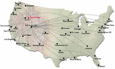
Air Travel Map

This map shows the different routes for an airline company. This is a type of flow map, however all of the lines are the same thickness. This does not allow the reader to know which route receives the highest rate of traffic by aircraft. Also, relief is used in this map, showing where the different mountain ranges are located.
http://premier-resorts.com/docs/SUN_VALLEY/us_flight_map.jpg

Social Network Map

This is a figure that maps out how people communicate with each other and who communicates with eachother. While this is a type of flow map, it is quite unique in its usage. A rumor could be traced back to its origin using this map.
http://www.humanproductivitylab.com/images/HP%20Social%20Network%20Network%20Map.jpg

Cartographic Animation

This image is the projected path of a hurricane. Land is predicted to expand the projected path of the hurricane, making it highly affected by land. This allows viewers to prepare for an intense storm.
http://www.jeffsweather.com/archives/Hurricane%20Dean%20Projeted%20Path.jpg

Isopleth Map

This map shows the average wind speeds along the coast of the Southeastern portion of the United States. Color enhances the depiction of the information and no drawn boundaries are created in the map. The greastest wind speeds are offshore to the East.
http://ogcuser.opengeospatial.org/pub/ogcuser/files/images/geoss3_crop_0.jpg

Bivariate Choropleth

This map gives much information about the inhabitants of the country. It compares many different properties about the citizens. Also, a pie chart is used at the bottom to compare the different ways land is used in Africa.
http://www.geocities.com/stevejford/Africa_Choropleth.jpg

Thematic Map

This is a thematic map of the United States that shows different regions of the United States that have experienced population changes. This map also shows histograms and proportional dot size to further relay information to the reader. There is a scale at the bottom of the map to keep everything in perspective in the map.
http://www.geocities.com/stevejford/USA_Population.jpg