Monday, April 27, 2009

Correlation Matrix

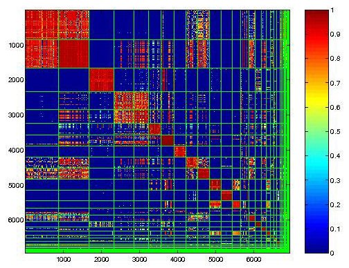
This matrix shows different classes of individuals in a country that have an economic situation. The number helps the reader to learn how prevelant a certain characteristic is of a certain economic class.
http://www.idrc.ca/openebooks/342-3/t0048-01.gif

Air Travel Map

This map shows the different routes for an airline company. This is a type of flow map, however all of the lines are the same thickness. This does not allow the reader to know which route receives the highest rate of traffic by aircraft. Also, relief is used in this map, showing where the different mountain ranges are located.
http://premier-resorts.com/docs/SUN_VALLEY/us_flight_map.jpg

Social Network Map

This is a figure that maps out how people communicate with each other and who communicates with eachother. While this is a type of flow map, it is quite unique in its usage. A rumor could be traced back to its origin using this map.
http://www.humanproductivitylab.com/images/HP%20Social%20Network%20Network%20Map.jpg

Cartographic Animation

This image is the projected path of a hurricane. Land is predicted to expand the projected path of the hurricane, making it highly affected by land. This allows viewers to prepare for an intense storm.
http://www.jeffsweather.com/archives/Hurricane%20Dean%20Projeted%20Path.jpg

Isopleth Map

This map shows the average wind speeds along the coast of the Southeastern portion of the United States. Color enhances the depiction of the information and no drawn boundaries are created in the map. The greastest wind speeds are offshore to the East.
http://ogcuser.opengeospatial.org/pub/ogcuser/files/images/geoss3_crop_0.jpg

Bivariate Choropleth

This map gives much information about the inhabitants of the country. It compares many different properties about the citizens. Also, a pie chart is used at the bottom to compare the different ways land is used in Africa.
http://www.geocities.com/stevejford/Africa_Choropleth.jpg

Thematic Map

This is a thematic map of the United States that shows different regions of the United States that have experienced population changes. This map also shows histograms and proportional dot size to further relay information to the reader. There is a scale at the bottom of the map to keep everything in perspective in the map.
http://www.geocities.com/stevejford/USA_Population.jpg

Planimetric Map


This is an example of a planimetric map of a town. It shows the roads from an areal point of view and is to scale. It also shows buildings that are points of interest. It is only a two-dimensional view and does not include any relief or contour.

Isolines

This is a map of China which uses isolines to determine the amounts of runoff rainwater. Each line collaberates with a number to present the of runoff water. The largest amount of runoff is located in the Western side of the country where the large mountain range is located. In addition to the isolines are lines for longitude and latitude.
http://www.handmaps.org/maps/hand_drawn_map_Yellow_BreachesFeat.jpg

Mental Map

Here is an example of a mental map that directs the user to get to Gettysburg. It is not to scale, however it depends on landmarks to be an effective tool for the user. Also, the fact that it is handdrawn adds to the fact that it is a mental map.
http://www.handmaps.org/maps/hand_drawn_map_Yellow_BreachesFeat.jpg

Unstandarized Choropleth Map

This map shows vacancies in different sections of a state. There are some areas that are not covered by the color, leading the reader to assume they are no vacancies in this area. It is considered unstandardized because it has not been areally averaged.
http://www.sfu.ca/unigis/images/price10.jpg

Digital Raster Graphic

This image shows the roads in addition to contour lines which give the map elevation. Labels are seen throughout the image, such as the river and areas of the town. It is a scanned image of a topographic map.
http://www.tceq.state.tx.us/assets/public/gis/images/drg.gif

Digital Orthophoto Quadrangles

This is an example of a color areal image. It uses infared film to create the infared image. This type of photo allows the viewer to distinguish different types of foilage, terrain, or bodies of water. The color seen in this photograph is actually false because infared wavelengths are unable to be seen by the naked eye.
http://www.dnr.sc.gov/GIS/images/doqq_ex2006.gif

Parallel Coordinate Graph


This graph shows the trends of a company's employees' money and their age. The darker location on the graph shows that this trend is more common than the areas that only have few lines. Also, the color represents different individuals.

Triangular Plot

This triangular plot describes the diet of New World Monkeys, Old World Monkeys, Gibbons, Apes, and Lemurs. At each corner is an exclusive diet and every group of animals is represented by a unique shape. This table provides the information that the majority of the animals enjoy fruits and seeds, while some leaves, flowers, gum and sap make up a portion of their diet also.
http://www.beyondveg.com/billings-t/comp-anat/chivers1992p61.gif

Similarity Matrix


This is a similarity matrix which describes different computing systems affected by malware. The red area shows the the most likely area where malware affects all of the systems consistenly. The color scheme allows the reader to interpret the data being presented in the figure.
http://cgi.mtc.sri.com/Cluster-Lab/01.jpg

Star Plot of Fossils

Each figure has lines that project from the center which represents data. The data consists of the different types of fossils for each species of animal. This type of information display is helpful when displaying different types of variables in the plot.
http://www.survo.fi/pictures/038c.gif

Boxplot

This is an example of a boxplot, which is also sometimes called a whisker plot. It shows the average for the data and also the extremes on each end the data. Boxplots are a very good way to compare two sets of data.
http://www.statmethods.net/graphs/images/boxplot1.jpg

Histogram

This is an example of a histogram, commonly referred to as a bar graph. Histograms have the advantage of showing exactly which ranges are highly populated and which are not. This makes the information easily interpretable.
http://www.physics.csbsju.edu/stats/bimodal.histogram0.gif

Sunday, April 26, 2009

Arm Span Length

This is an example of a stem and leaf plot. It shows the different arm spans that range from 130 cm up to 172 cm. The advantage of this graph is that it easily displays the average length, which is in the lower 150's.
http://www.europa.com/~paulg/mathmodels/VMII-17d.gif

Windrose Graph

This is an example of a windrose graph. It shows the percentage of whatever speed an object was moving in each direction. Also, this graph uses color to give the range of each individual speed.
http://lion.cs.uiuc.edu/projects/wsn_ornl/windrose.png

Population Profile


Specifically, this graph is called a population pyramid, due to the shape of the figure and the groups of people that it represents. The trend seems to be that AIDS cases increase till the individual is 20 years old then the trend seems to dwindle some what. AIDS has quite the same trend in men as it does in women also.

Climograph

This graph shows the precipitation levels, as well as the average temperature duing each month in Australia. This information correlates to a specific location, Walgett.
http://www.uwsp.edu/gEo/faculty/lemke/geog101/images/09_climograph_BSh.gif

Lorenz Curve


This graph shows the values of the cumulative population versus the cumulative income during both the '01-'02 year and '05-'06 year. The perfect equality line is inserted to depict what the equally proportional values would be. The area above the line is considered the equal area and the area below it is considered the inequal area.
http://www.northlan.gov.uk/business+and+employment/local+economy/economic+information/lorenz+curve.jpg

Index Value Plot

This type of graph shows the average flows of streams in North Carolina over a ten year span. These averages are comparable to the normal value, which is 4. All of the values following 1999's data is relative to the first value.
http://water.usgs.gov/waterwatch/regplots/real/real_nc_2.gif

Range Graded Proportional Map

This map shows the different population density of each of the counties. The size of each circle corresponds to a specific value, given in the table on the left. This makes the map a range-graded dot density map.
http://www.photographicviewpoints.com/Geo486/images/Lesson8/Proportional.png

Nominal Choropleth Map

This map potrays areal data and is distinguishable by the boundaries of the states. The fact that the map potrays information that is not numerical, but rather by different categories makes it nominal. This particular map shows four different categories.
http://mapmaker.rutgers.edu/355/lethal_injection3.jpg

Digital Line Graph

This is an example of a DLG. It shows both the topography contour lines and also the roads. The boundary of the gravel pit is also shown.

Isotach Map

This map is considered to be an isotach map because it uses the contour lines to depict wind speeds, rather than terrestrial terrain. However, the lines are still used in the same fashion, that if lines are very close together, then there is a greater change.
http://weather.cod.edu/help/850tach.gif

Bilateral Graph

This type of graph is considered to be bilateral because it shows two types of information being portrayed on the same graph and visualizes the trend of both against eachother. Here the percentage of demand deposits is compared to the percentage of long-term deposits.

Topographic Map

Above is an example of a topographic map. It is a topographic map because it shows the shape of terrestrial terrain. It shows the relief and shape of the land from above through the use of contour lines. The closer they are together, the more extreme there is in the change of height, like a cliff, while if there is distance between the lines, the change is more gradual.
http://geology.isu.edu/geostac/Field_Exercise/wildfire/images/topomap.jpg

Proportion of Internet Users in Europe

This data is shown by circles. The size of the circle is proportional to the number of internet users in each country. These circles are categorized as being continuously variable symbols.
http://www.geog.ucsb.edu/~jeff/gis/proportional_symbols_files/map2.jpg

Wednesday, April 22, 2009

Doppler Radar Image of Hurricane Katrina

This doppler image can show both the type and intensity of the rainfall, and also the motion of the air. This is very helpful when looking at a large cloud mass, allowing the individual to determine where the majority of the rain will fall.
http://www.micrometgroup.com/images/300px-Hurricane_Katrina_Doppler.gif

Tuesday, April 21, 2009

Digital Elevation Model

This is a digital image of the Sahara Desert in Tunisia. It shows different elevations and is colored and shaded to show the differences in terrain elevations.
http://www.satimagingcorp.com/galleryimages/digital-elevation-model-high-resolution-dem-sahara-tunisia.jpg

Unclassified Choropleth


This is a map of the population trends in France in 1836. It is unclassified because it is created using a gray scale and has as many units as intervals.

Scatterplot

This is an example of a scatterplot graph. It includes a trend line that marks the average of the values. There is a positive and weak relationship between the points.
http://allpsych.com/researchmethods/images/scatterplot.gif

Isobar Map

This is an example of an isobar map. It is commonly used when mapping the weather. Each line represents different amounts of air pressure and this technique was founded by Brandes.
http://www.escootersnz.com/fastpage/images/ms_1pm_iso_311204.gif

Wednesday, April 8, 2009

LIDAR

LIDAR uses lasers to create the image. This image is of the large crater floor of Mt. St. Helens.
http://vulcan.wr.usgs.gov/Volcanoes/MSH/Eruption04/Monitoring/ImagesGraphics/LIDAR_crater_dome_sept03_and_nov04_animated.gif

Black and white aerial photo

This type of photo gives an extremely accurate depiction of an area. The film used is sensitive to the same wavelengths as the human eye. The vegetation looks the same, but water is distinguishable from the land.
http://freegeographytools.com/wp-content/uploads/2007/09/doq-thumb.jpg

Infared Arial Photo

This type of photograph can help distinguish between different types of vegetation. It shows wavelengths that are not visible to the human eye.
http://sal.uamont.edu/pages/nsdd/doq_examples/CIR_DOQ.jpg

Thursday, April 2, 2009

Flow Map

This type of map shows both the movement and intensity of an object across the map. Examples of the object can be traffic, ideas, or migration of people, just to name a few.
http://infosthetics.com/archives/flow_map_layout.jpg

Wednesday, April 1, 2009

Statistical Map of Traffic

This map shows the daily traffic levels of a rural area in Idaho. The thickness of the road is determined by the numerical value of cars that pass on that specific road. This type of map can communicate the relative scaling of map properties.
http://student.britannica.com/comptons/art-54597/The-magnitude-of-movements-between-places-can-be-shown-by?&articleTypeId=31

Cartogram

This map shows the percentage of endangered species in each country. Each country is morphed to represent the number of species per country. Also, color is included to represent the different percentages.
http://www.amphibiaweb.org/amphibian/cartograms/cart_threatenedpercentage.jpg

Levels of ash fall from volcano in Nicaragua

This is an example of a contour map, specifically an isopach map. It can be used to assist geologists.
http://www.volcano.si.edu/volcanoes/region14/nicarag/cerroneg/14neg13f.png

Bird watching in Canada and United States

This is an example of a dot distribution map. Each dot represents the location of a zipcode that birdwatchers reside and participate in the observation of birds.
http://www.birds.cornell.edu/pfw_fr/Members/images/ParticDistribMap00-01.jpg

Propoganda map during the Cold War


This map shows the influx of goods and machines to countries in Eastern Europe during the Cold War. It depicts a mix of a heart and an octopus.
http://www.newberry.org/smith/slidesets/images/vs1_3_tn.jpg

Deleware County cadastral map

This map is an example of a systematic Public Land Surveying System map. It also uses color to distinguish the different sections.
http://www.dalisproject.org/images/cadastral_map.jpg

Apennines mountain range in Italy


This is a hypsometric map that uses color to bring out a third dimensional look of the mountain range in middle Italy. The yellow represents the lowest elevation where the white represents the highest.
http://berkeley.edu/news/media/releases/2008/12/18_alvarez.shtml

Ethnic groups in Chad

This map shows the different ethnic groups located in Chad in 1969. It is a hypsometric map that uses color to distinguish the different groups.
http://www.lib.utexas.edu/maps/africa/chad_ethnic_1969.jpg

Temperature/Precipitation in Brazil


This is an example of an Isohyet map. It shows different levels of the annual rainfall in Brazil.
http://www.lib.utexas.edu/maps/americas/brazil_temp_1977.jpg